
What are responsive logos? Do you need one?
Logos have become almost synonymous nowadays with Branding. Despite being two separate things, it’s okay to forgive the average person for mixing them up. Logos are after all, an essential part of Branding. It is also the easiest to understand and explain.
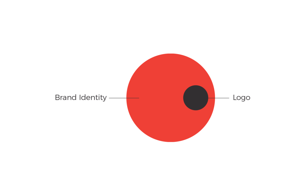
A logo is a mark or identifying element that helps people recognize and identify your brand. Logos are clearly important and I think everyone understands that to some extent.
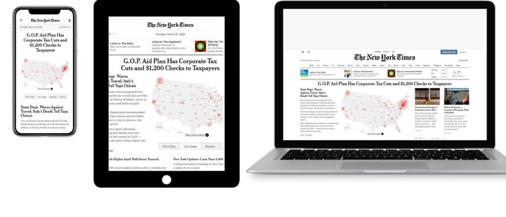
So let’s move on to the title of this article. What on earth is a responsive logo? By now, every marketer or brand manager has memorized the gospel about how important it is for your webpage to be responsive. In today’s age, a non-responsive website is a surefire way to drive away your customers. But can logos be responsive too? Of course they can.
Being responsive simply means that whatever you have designed or developed must respond to the user’s behavior and adapt. Imagine if you were watching Netflix on your TV and everything works absolutely great. You can pause, play, navigate and find all the juicy suggestions just where they should be. Now imagine if you want to do the same thing but from your mobile phone and suddenly nothing is where it is supposed to be. You get the gist. If things remained simply the way they were, without changing, despite the screen size or platform, it would cause the user experience to be terrible.
Similarly, just like your websites, logos too need to be responsive to adapt to the environment they are being displayed at. The earliest logos were symbols and family crests that identified dynasties, kingdoms and organizations. We have come a long way since then. Try looking around you and you will have a really tough time finding anything that doesn’t have a logo on them. Human beings now produce an incredibly large number of goods and services, some of them offered in different regions by many different companies. The need to differentiate and be identifiable by customers is more important than ever. Granted, logos are not the only thing that helps to identify a brand but that’s a story for another article.
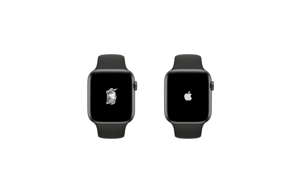
Logos are everywhere. From being printed on 50 feet billboards to being laser etched on your vape. With the advent of digital and highly mobile viewing spaces. Logos now need to exist in forms they previously never needed to. Imagine trying to fit the old apple logo on your shiny new apple watch.
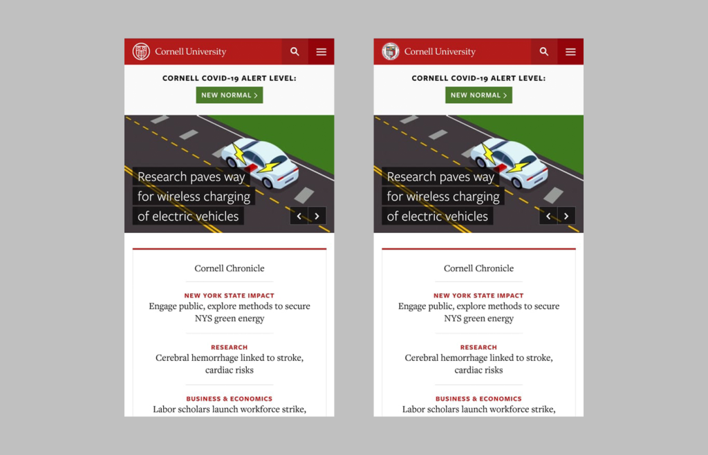
What apple did is completely change their logo to something simpler and more versatile. The simple form works for smaller screens. The Nike logo is another example. Does that mean every brand can just change their logos to something minimal and abstract? For a new brand, sure. But for a brand with heritage and history? That’s when things become more difficult. Imagine if you’re a very old, recognizable institute. You can’t change your logo overnight to something no one recognizes. Take the example of Cornell University. They are an old, reputed institution. They couldn’t just change everything over night. Instead they revamped their logo to simplify it, while keeping the most prominent and recognizable elements.
You couldn’t quite fit that old logo on a modern mobile website, could you?
Creating simpler versions of logos to fit smaller screens is the first step into responsiveness. But often one version isn’t simply enough. Brands now need to to create variations of logos with varying degrees of detail just so they can be used in every possible use-case without losing any recognizability.
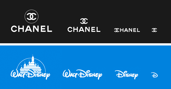
Take two examples of Disney and Chanel. With every version, you can see that the logo gets simpler and more and more fine details are taken away. If you simply resized the larger logo, it would get cluttered and lose a lot of the details. Remember, logos need to be recognizable. That would be tough to do if people forgot your cluttered logo.
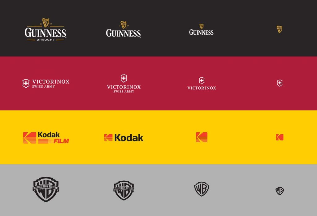
Here are a bunch more examples. Notice how no matter what scale the logo is at, you can still recognize the brand just as well? The logo has variations and adapts to the environment it is placed on. And that is what a responsive logo is.
You can visit this website to see some very popular brands and how their logos respond when you change the screen size.
You might not be a Fortune 500 company with thousand different things to place your logo on but even smaller companies and brands help from having a simpler, more versatile logo. Remember, it is what your customers use to recognize you.
Before you go around splashing cash on the next hip digital marketing agency or churning out that shiny new packaging, you might want to re-consider whether your logo is performing well across it’s touchpoints.
You can always reach out to me for consultations and suggestions regarding your brand.